The first version of a room, a page, or a sequence usually arrives with too much certainty. It has energy, it has speed, and sometimes it even has the right idea, but it rarely has enough distance. The second look is where proportion starts to settle and intention stops sounding like a pitch.
We have been thinking a lot about that pause lately. Not the dramatic pause that asks to be noticed, but the small one between pinning references on the wall and deciding which of them still matter the next morning. It is a useful moment because it exposes what was only trend language and what was actually carrying emotional weight.
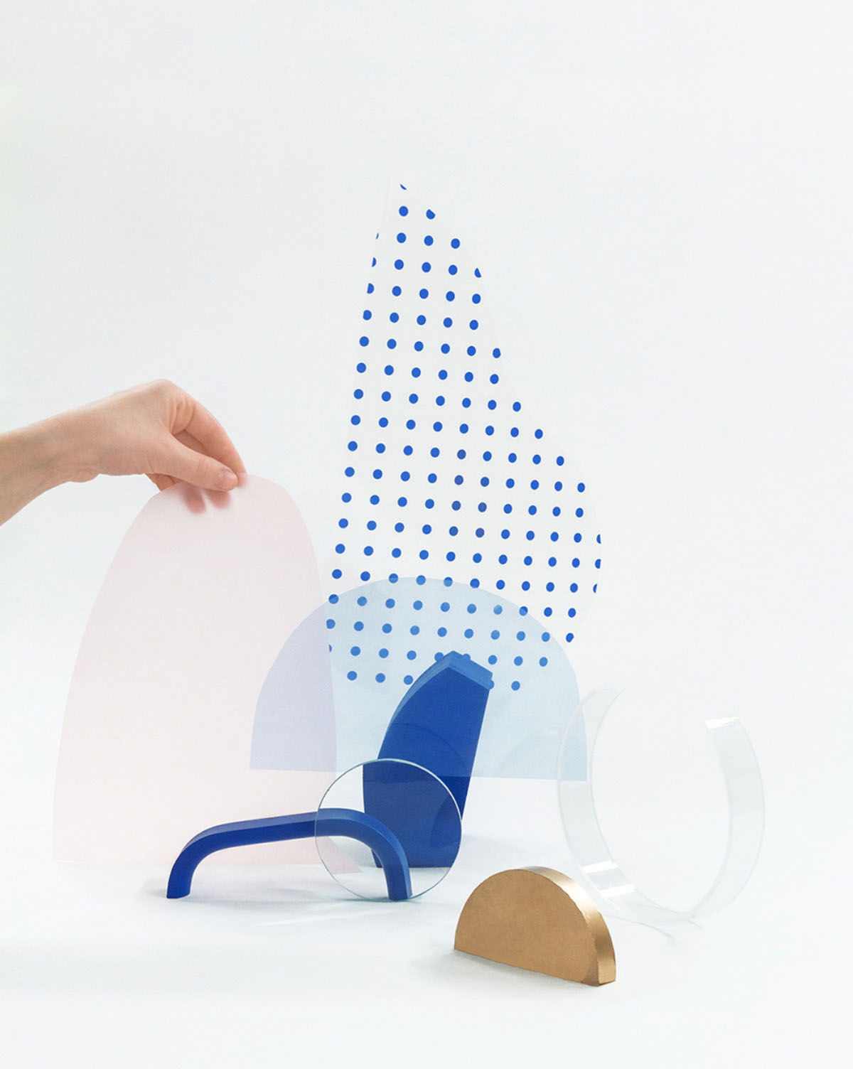
A project starts to speak when you stop asking it to perform.Studio note
Distance is part of the process
Most good edits happen when we stop standing too close to the work. A layout that felt complete at midnight can look overdesigned in daylight. A sequence of images that seemed expressive can suddenly feel loud. The answer is rarely to add something clever. More often, the answer is to remove one beat, soften one contrast, or let a simpler gesture carry more of the composition.
That second pass has become one of the most reliable tools in the studio. It is where we notice whether a project has only style or whether it has rhythm. It is where the work begins to make room for the person reading it, walking through it, or living with it over time.
What stays after the first excitement fades
We have learned to trust the details that still feel necessary after a little distance: the line that clarifies rather than decorates, the material shift that changes the atmosphere of a room, the image that keeps the sequence grounded. Those are the choices that survive the second look, and they are usually the ones worth building around.
For demo work especially, this matters. A starter needs more than a strong first impression. It needs repeatable clarity. It should give people a sense of tone without locking them into somebody else’s performance. That usually comes from editing with patience rather than designing with volume.
The second look is not where momentum dies. It is where the work becomes usable, generous, and a little harder to forget.