We like to pretend that color is an early decision because it is easy to point at, easy to name, and easy to screenshot. In practice, the palettes that last are usually the ones that arrive later, after the project has already discovered its pace, its temperature, and the kind of memory it wants to leave behind.
When a project begins, we rarely ask which shade should lead. We ask different questions. Is the room meant to feel still or social? Should the sequence open with softness or contrast? Does the work need to feel collected over time, or crisp enough to seem newly assembled? Those answers do more for color than any swatch library can.
The right palette feels remembered before it feels selected.Studio note
Working from atmosphere instead of trends
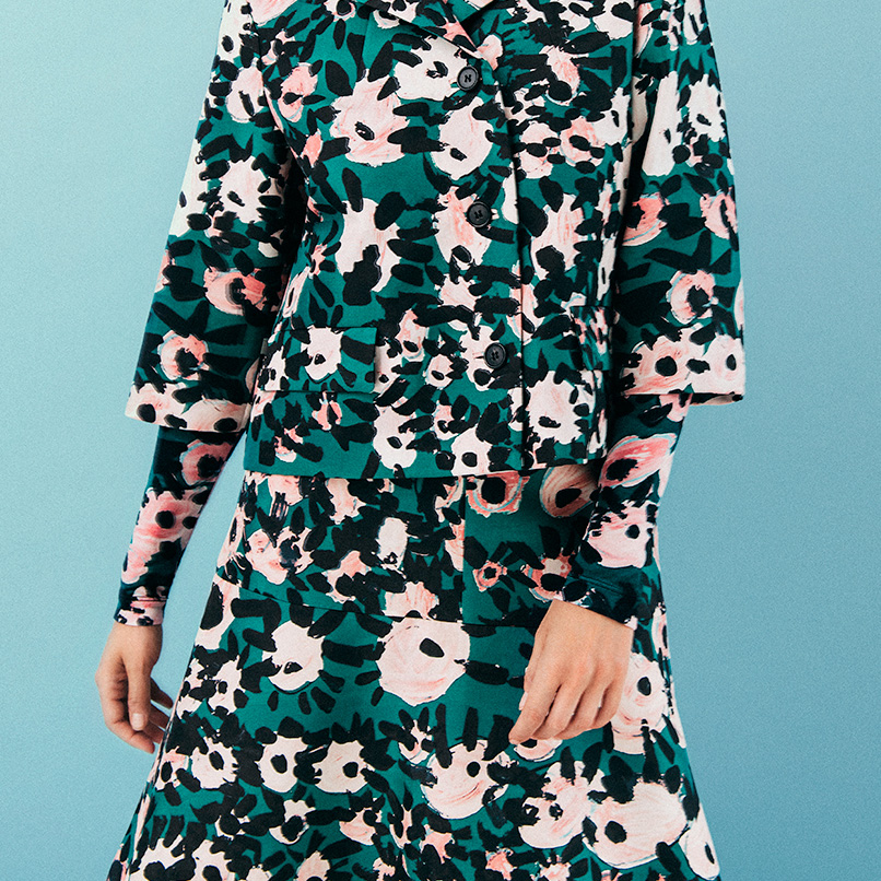
We tend to collect surfaces before hues: a piece of woven fabric, a painted edge, the way afternoon light cools a wall, the muted green that only appears when brass starts reflecting into plaster. These fragments do not look like a finished system on their own, but they build a vocabulary. Once that vocabulary exists, color becomes less decorative and more structural.
This is one reason we still like references that carry a little wear. They remind us that visual identity should not feel vacuum-sealed. It should have some trace of handling, weather, repetition, and ordinary life. Even the boldest palette becomes more believable when it seems to have been lived with for a while.
Letting the palette arrive
By the time color enters the conversation in a final way, many of the important choices have already been made. The spacing has a cadence. The typography has a voice. The imagery knows whether it wants restraint or friction. At that stage, color can do its real work: connect decisions that were made separately and make them feel like they belong to the same world.
That approach has been useful for starter content too. Demo pieces need enough character to feel authored, but they also need enough openness for someone else to continue the story. A late palette is often a more generous palette. It leaves room for adaptation while still giving the work a clear emotional register.
Color matters, but memory usually gets there first. When the atmosphere is right, the palette has a much easier job.